
>A friend of mine recently contacted me to create a flyer for her new side business of selling car insurance. She needed a small flyer to be able to hand out to people as a promotional piece, to let them know of the services she offers and the discounts she can make.
 Traditionally, the design for these types of flyers is colorful and noisy. There’s typically a lot going on and the eye does not rest easily on the page. One of the sample flyers she sent me is to the right. The colors are simple, but bolder. The design is messy–the eye does not know where to go, what to look at.
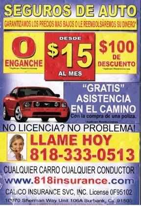
My friend gave me the basic layout of her own flyer that she created in Photoshop. Like the standard ads, she wanted bright, bold color and a fancy car to grab attention. She wanted to offer coupons and make sure to include all of the relevant points that might attract customers.
 What I wanted to do was to make the design cleaner and more attractive. I wanted her potential customers to be able to glance at the flyer and know what it is that she is offering. To do this, I used the bright colors only on the important concept points of the flyer: the title, the phone number and the coupons/discounts that she could offer. I also made use of size variations of fonts, to help direct the viewer’s eye, so that not everything has the same weight and importance. This is a lot of information in a little space (5.5″x4.25″, or 1/4 of a sheet of paper), and so as a designer, I have to help prioritize for the viewer the eye-catching, important, big-picture concepts.

What was a new learning curve for me was that I had to take this same flyer that I created in English and re-create it in Spanish. My friend wanted one side to be English and the other side to be Spanish, because she is trying to build a bilingual insurance business. At the beginning of this project, I thought that would be an easy step, but I learned that it can actually be a design challenge. The design I had created worked really well with English words, but when translated into Spanish, I needed to make choices about how to display the information when some of the words and phrases were either much longer or much shorter than the English wording. For instance, in the red starburst, the $0 down works really well as a unit. Seems balanced in the space. But if I were to do that exact same placement of words in the Spanish version, it would throw the whole starburst out of shape. Likewise, with the coupons, I had to widen the shape of the coupon and adjust the wording placement so that it would fit and not look funky.
All in all, both my friend and I are really pleased with how the flyer turned out. And it was great experience for me to be able to figure out how to do the same design and create the same look and feel, but with different wording content.
Pingback: Insurance Advertisement | What's Jenny Making?